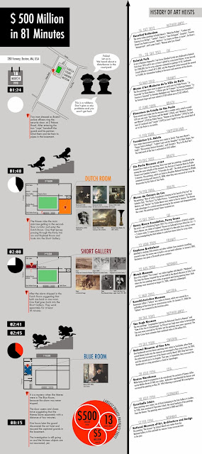
Finally I realized the info graphic about the Boston Art Heist in combination with a timeline about other art robberies. But I focus on the chronological event of the Boston Heist. So the left segment is illustrated more detailed and with many figurative elements. Contrary the right segment is providing only text. I tried to visually distinguish the parts by using different background colors.
In my research about the facts, I found out that it is not clear at all about how it happened exactly. That is why I decided not to focus on the mysteries. The event is divided in four sections that are arranged vertically. So the viewer can scroll down and focus on each step. The vertical order serves as an guideline that is visually supported by the clock element. I chose two elements for illustrating the time: the clock shows the time of the action and the pie-chart emphasizes how much time has passed since they entered the museum. The map visualizes the location of the museum with the street names. I think it is not necessary to show the city environment more detailed. Maybe the location of Boston in the USA could be additionally a useful map. Or is the global location more important than my street-detail?
Furthermore I used the floor plan of the museum to illustrate from which room the art was taken. Not as functional as these elements are the figurative icons of the thieves. It is more like a visual hint that they dressed as police men and were going up to the second floor. But these abstractions are useless without the context. That's why I added some explanations for each step to make it more comprehensible.

I do like very much your graphic because it gives a lot of information but in a very hierarchical way that combines more visual information in front of a more textual information.
ReplyDeleteI think your graphic is very good to be alone and it would convey a lot information, but if you wanted to use it together with a text, may be it will have too much information and will lead the text to a second place. But, anyway, I think your graphic is complete and clarifying at the same time.
Good job Lisa!