The Curriculum Vitae is an essential part of the application. Especially in creative professions it is important to express our personal skills with the design and layout of the application. An information graphic is a great chance to show your qualities visually and to make it memorable. In competition with other applicants it is important to communicate your complex history in a compelling way. The presentation of your history, experience and skills gets even more individual with a special design and idea.
Creating an own CV info graphic is my first project. In that progress, I did some research for finding some inspirations.

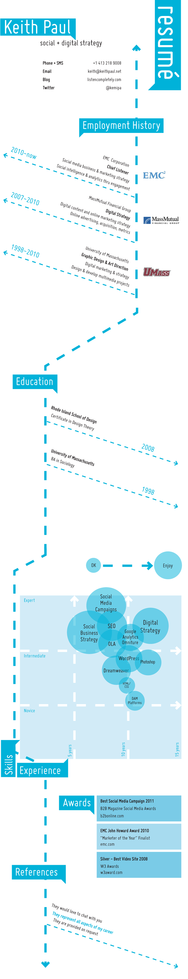
My first example is quite simple using familiar elements of data visualization like time lines, donut chart, bar chart. The clear and light structure of information is focussing on the most important facts about the experience as a "communications professional". I really like the color scheme in that info graphic. The colors have a reference in every aspect (Things I Do, My Tools and Chronology) and abstract the complexity. This kind of information organization makes it more intelligible for understanding it visually and serves as a guideline through the different aspects. Color cues categorize the skills and reinforce the message about the experience.
The only figurative and novel element is the pocket knife that functions as a metaphor. On the one hand side it is an exemplar icon in the class of "tools". Additionally it has a symbolic meaning referring to universality. I think this is a very smart idea for capturing the essential characteristics figuratively. Furthermore it stands for a humorous character.

In comparison, this second example is much more dense working with a lot of text. I think it doesn't focus on the most important facts and is overloaded. Some information might supposed to be funny, but for me there are too many useless facts. There are many icons and numbers for expressing the variety and quality. Unfortunately the numbers don't transfer any information because there is no context. I really like the idea showing "praise"quotes and a "mission statement" for some personal and individual perspectives. Also a map is a nice visualization for international references. Including some QR-Codes for linking to further information is a very novel idea for interaction with the content. I really like some elements in the design of the CV but not the whole appearance because it is not guiding the viewer well. Finally it is really hard to decide how to judge this applicant.
I agree with you that the second information graphic is indeed very dense and complex - and the visualization doesn't make it any lighter - on the contrary! But I do like some of the elements in it. Especially when he uses a picture of himself in the middle of the drawings of men - it is very effective. And there are other parts that separately work very well, but the overload of text and graphics makes it too messy.
ReplyDeleteThank you for your opinion! I agree on you that humorous elements can also work functionally in an info graphic. Especially in a CV these elements show some personality.
ReplyDelete